Experience Center
Evaluating User Details
To better understand the digital experience for a user, view the user details page for user and device metrics.
To access user details, choose one of the following options:
- From the User Overview page, select one or more applications from the Applications filter drop-down menu and click Apply. Click the table cell for User or Devices to view a page with details about the user's digital experience.
- Locate a user and view their page.
Any filters used on the User Overview page remain in place after selecting a user or the user's device. Click Reset to adjust or remove the filters.
You can access the following user details:
- User Devices
This section displays the devices in use and specific device information, such as the OS type and version, CPU, Memory, Private IP, Public IP, etc. If there is more than one device, the first device is automatically selected. You can also use the scroll bar on the left to select and view device information when multiple devices are in use. The device remains selected even with time range and other filter changes. Devices in this section are displayed depending on the time selected and factors such as device network issues, offline/sleep status, etc. The data on the rest of the page also populates depending on the device selected.
The Tunnel Type that displays depends on the device profile. The available tunnel types are:
- Tunnel 1.0 or TWLP
- Tunnel 2.0 in DTLS Mode
- Tunnel 2.0 in TLS Mode
- Tunnel Unknown
If a Tunnel Type is Unknown, it means Digital Experience Monitoring could not detect it.

The User Device Information window displays additional device information organized under the Hardware, Network, or Software tabs. Click the different tabs to view additional information. For example, on the Software tab, you can view the Digital Experience Monitoring and Zscaler Client Connector versions for the device.
Close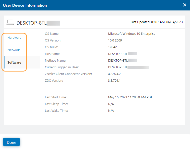
- Applications
All the applications selected in the Applications Filter are shown. You can see the period of time that is covered above the applications.
Each application has a ZDX Score. Compare the different applications to understand how they are impacting a user's particular ZDX Score. If there are more than three applications, scroll left or right to see more applications. By default, the application with the lowest ZDX Score is selected.

Selecting an application updates the rest of the information that appears in the page. By changing the application, the subsequent sections update accordingly. Each of these allow you to further understand the application and its impact to the user for the selected point in time. The metric information is based on what was chosen when setting up a probe. To learn more, see Configuring a Probe.
Close - Viewing ZDX Score Over Time
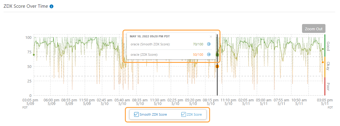
The ZDX Score Over Time graph shows how the ZDX Score trends over the selected time period for this user by device. If a device is not selected, this graph is not populated.
In the ZDX Score Over Time graph on the User page, the Smooth ZDX Score displays by default. The Smooth ZDX Score uses historical data to reduce short-term variations in the ZDX Score and to provide a more representative metric with reduced variability. Select the checkbox option below the graph to view the ZDX Score. This selection remains even when changing filters and applications.
Both scores track as lines across the graph. Scores fall into three categories:
- Good: The score is above an acceptable threshold and ranges from 66–100. The color for this range is green.
- Okay: The score is acceptable and ranges from 34–65. The color for this range is amber.
- Poor: The score is below an acceptable threshold and ranges from 0–33. The color for this range is red.
You can select a point on the graph to see the exact date, time, and Smooth ZDX Score for that period in a tooltip. If the ZDX Score option is selected for the graph, the tooltip displays the ZDX Score at that time as well. If there is an Error icon (
 ) at the point, you can view more information about the cause and the related application. Click the Details icon (
 ) next to the score in the tooltip to go to the Applications page for further details about the application.
A Zoom In icon (+) appears as you hover over the ZDX Score Over Time graph. Use this icon to select the time period to zoom in for greater detail. This shows the graph over that smaller time period. The Web Probe Metrics, Device Health, and Cloud Path also reflect the same period of time. The time limit to zoom in is 5 minutes. Click Zoom Out to view the original graphs.
You can also enable and display incident data in the ZDX Score Over Time graph that's reflected on the Incidents Dashboard, based on the timeline of a particular incident. To view incident data:
- Click Show Incidents.
- Hover over an icon that represents one of the incident types: Wi-Fi, Last Mile ISP, Zscaler, or Application. The names of the incident type and epicenter are displayed, along with the number of impacted users.
- Click View Incident to see the incident's details and key metrics.
To learn more about incident types, see Monitoring the Incidents Dashboard.
Close - Analyzing the ZDX Score: Single Date and Time
For Poor scores that range from 0–33, the ZDX Score Over Time graph includes a feature to help identify reasons for the low score. The application tile with the lowest Poor score is preselected, and Digital Experience Monitoring runs root cause analysis automatically on the most recent Poor score. As a result of the analysis, potential factors are provided that might have contributed to the score. If you select a different application tile, Digital Experience Monitoring analyzes its most recent Poor score within your selected timeline.
Automated analysis for Poor ZDX Scores is not applicable to Digital Experience Monitoring Call Quality applications.
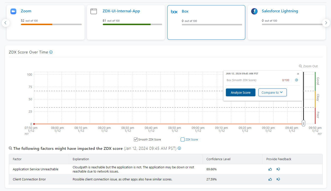
If you select a different data point on the graph for a Poor score at a specific date and time, click Analyze Score within the tooltip to, again, trigger potential factors that might have contributed to the score.
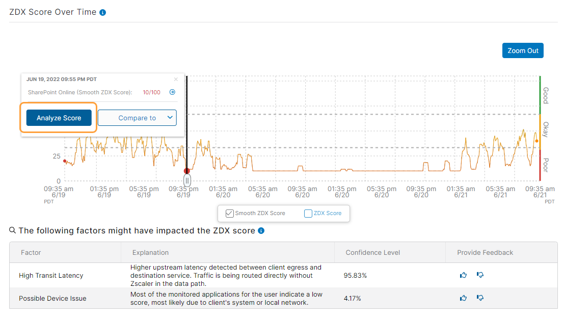
The analysis table provides the following information for a particular date and time in the graph:
- Factor: Shows a probable cause for the low score.
- Explanation: Addresses why the corresponding factor might be the issue.
- Confidence Level: Quantifies the assumed accuracy of the analysis, based on probes with similar issues.
- Provide Feedback: Lets Zscaler know the accuracy level of the analysis.
- Click the thumbs-up icon (
 ) if the analysis for the low score was helpful. A success message confirms Zscaler has received your feedback.
 - Click the thumbs-down icon (
 ) if you believe the analysis was inaccurate and the low score is related to a different issue.
- Select one of the potential factors from the drop-down menu. If you believe a different factor caused the issue, select Other and specify the factor.
- Share any other details about the issue.
- Click Submit.
- Click the thumbs-up icon (
Close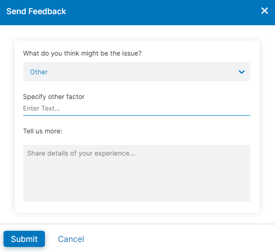
- Analyzing the ZDX Score: Time Range
As an additional method of analyzing Poor ZDX Scores beyond a particular date and time, the ZDX Score Over Time graph also includes an option to analyze scores within a time range. After you select a point on the graph for a Poor score at a specific date and time, complete the following steps:
- Move the slider to the right on a second point in the graph. This point represents the end of your time range.
- Click Analyze Range to display potential factors that might have contributed to the low scores within your specified time range.
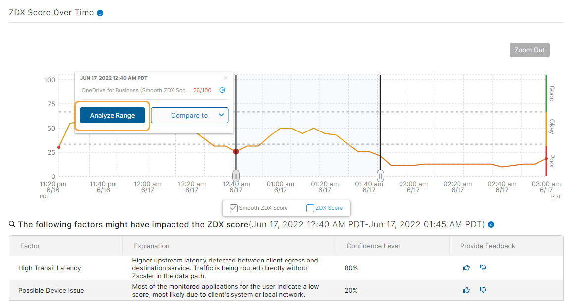
To learn more about the details in the analysis table, see Analyzing the ZDX Score: Single Date and Time.
Close - Comparing ZDX Scores
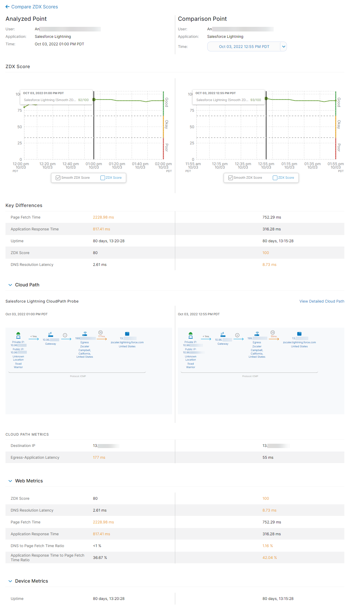
You can compare ZDX Scores for an application to understand why they might vary at different points in time. A score comparison can highlight why a current score might be considerably different from a previous score. The feature utilizes web, device, and Cloud Path metrics to help determine differences in scoring.
Web metrics are not used or provided when comparing scores for a Network application.
After selecting a point within the ZDX Score Over Time graph to start your comparison, do one of the following from the Compare to drop-down menu:
- Compare the ZDX Score of your selected point to a previous ZDX Score.
- Compare the ZDX Score of your selected point to a future ZDX Score, up to the current date and time.
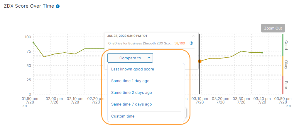
To compare your selected point to a previous ZDX Score, use a provided timeline from the drop-down menu:
- Click Compare to.
- Select Last known good score or one of the time range options. The option for Last known good score searches the score history for the last available score between 66 and 100. The time range options show the score from the same time on the previous day, 2 days, or 7 days. The Compare ZDX Scores page appears.
The page provides the following details and metrics:
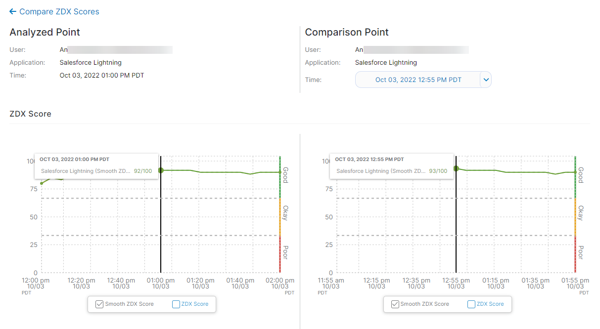
- Analyzed Point and Comparison Point: The Analyzed Point represents the initial date and time you selected for the application. The Comparison Point represents the date and time to which you're comparing the Analyzed Point. Use the Comparison Point time range filter if you need to specify a different date and time for comparison.
ZDX Score: Shows the side-by-side ZDX Score graphs for each selected point. To learn more about ZDX Scores, see About the ZDX Score.
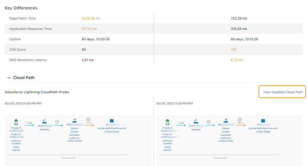
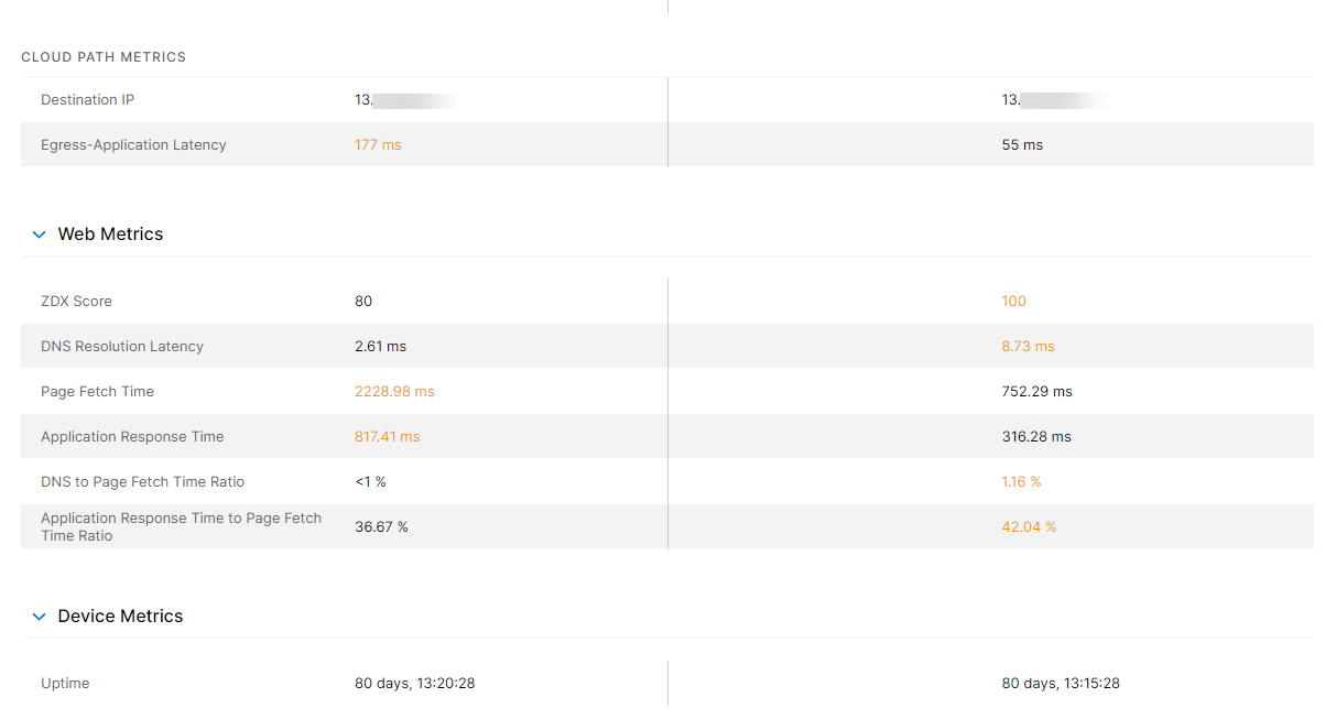
- Key Differences: Shows the differences in metric values for each selected point. The higher value for each metric is highlighted.
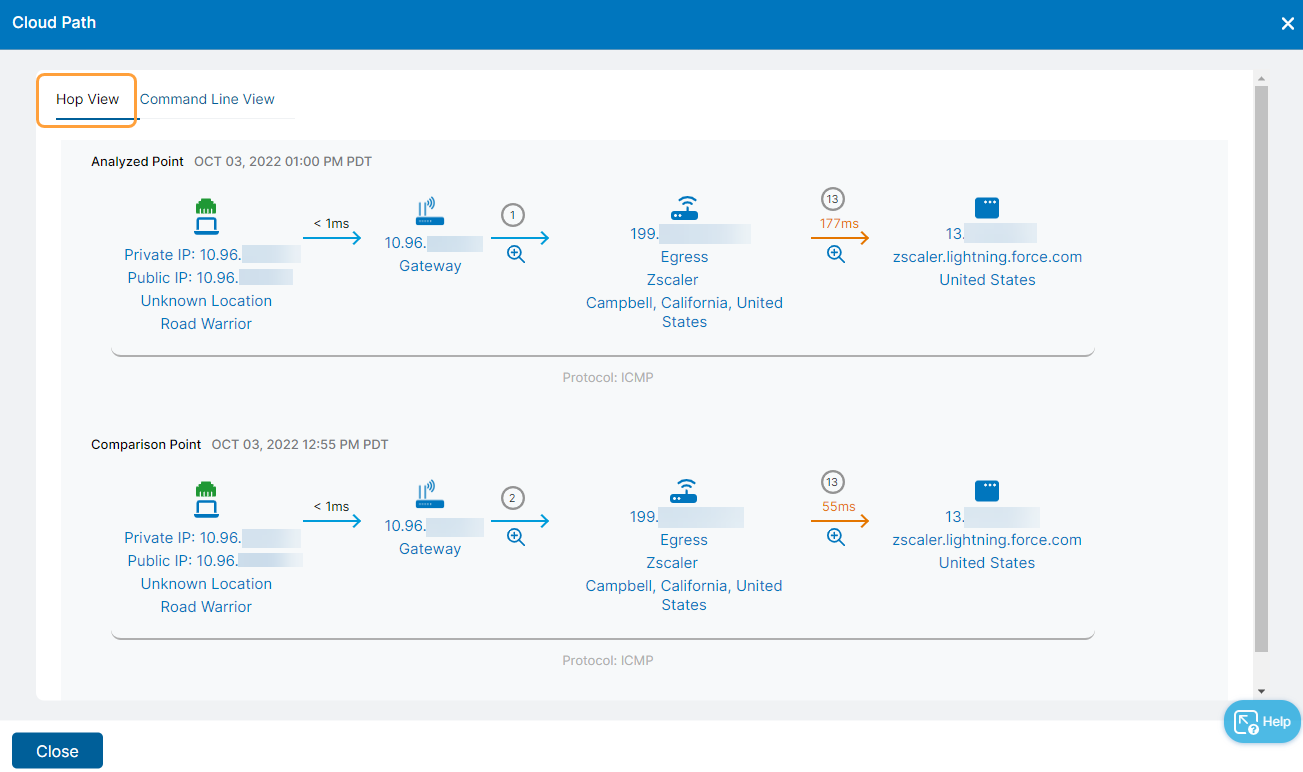
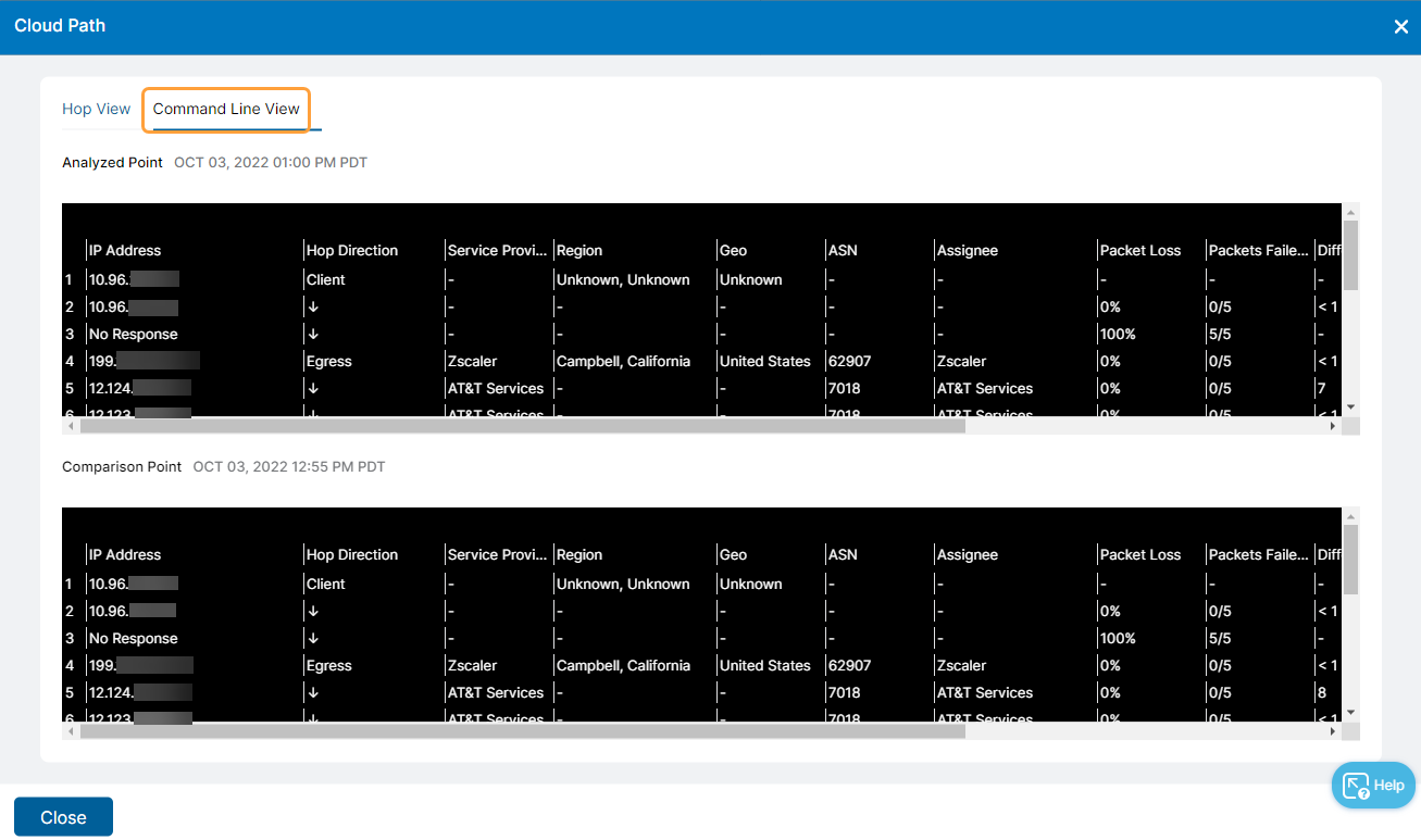
Cloud Path: Shows the hop views for each selected point. Click View Detailed Cloud Path to access either a larger Hop View or the Command Line View.
Hop View: Shows a comparison and any differences in the Cloud Paths from the user's device to the application. To learn more, see Evaluating the Cloud Path.
Command Line View: Shows a text-based comparison of the Cloud Paths. To learn more, see Evaluating the Cloud Path.
- Cloud Path Metrics: Shows the Cloud Path metric values for each selected point. The higher value for each metric is highlighted.
- Web Metrics: Shows the web metric values for each selected point. The higher value for each metric is highlighted. Web metrics are not provided for Network applications.
Device Metrics: Shows the device metric values for each selected point.
To compare your selected point to either a previous ZDX Score at a custom date and time or to a future ZDX Score (up to the current date and time), use the Custom time option:
- Click Compare to.
- Select Custom time from the drop-down menu. The Compare ZDX Scores page appears.
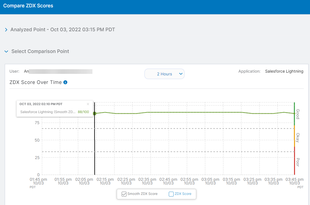
- Select your Comparison Point in the ZDX Score Over Time graph. Use the time range filter if you need to specify a different time range not shown in the graph.
- Click Compare to show ZDX Score details for both the Analyzed Point and the Comparison Point.
- Web Probe Metrics
The Web Probe Metrics section shows the application being monitored and provides the following metrics for the application:
- Page Fetch Time
- Server Response Time
- DNS Resolve Time
- Availability
Web probe metrics are not provided for Network applications. To learn more, see Monitoring the Performance Dashboard.
Page Fetch Time reflects how long it takes the selected application to load a page for the user. The Page Fetch Time graph includes a baseline for any given region with at least one active device. For predefined applications, the baseline represents an average score based on device metrics across all organizations. For custom applications, the baseline represents an average score based on device metrics from a given organization.
Baseline metrics are calculated daily for each application on a rolling timeline of the previous 7 days. The baseline value is measured in milliseconds, as shown in the following example:

Users with an Advanced Plus subscription can view a tooltip with DNS, SSL, TCP, TTFB (Time to First Byte), and TTLB (Time to Last Byte) metrics that comprise the total Page Fetch Time. Additional graphs are displayed for PAC parsing time, DNS time, TCP connect time, HTTP connect time, and SSL time. Where applicable, individual server redirects are included for each graph to reflect one of the following:
- Client to Public Service Edge
- Public Service Edge to the application
- Client to the application
If more than one redirect is displayed, the last redirect indicates the time to the final destination.
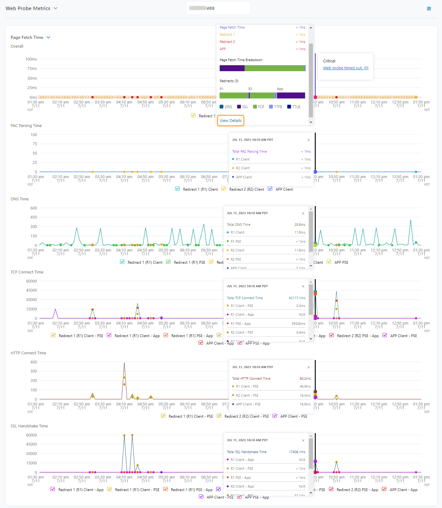
Click View Details within the tooltip to see the Total Page Fetch Time, as well as the metrics for Total Bytes Transferred and Total Throughput. Hover over the bar graph to view the individual time metrics for each server redirect.
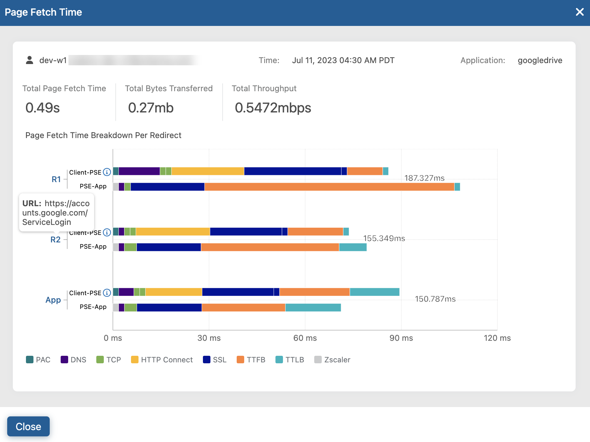
All metrics are preselected, but you can click the menu and deselect metrics that are not relevant to your understanding of the application. Click a point on a graph to see the value or percentage for that exact date and time. When you click a point on one graph, all graphs show their values for that same point.
Whenever traffic is steered through Source IP Anchoring (SIPA), via SIPA is displayed and the corresponding traffic within the timeline is highlighted in the graphs. Traffic forwarding through SIPA enables you to control the source IP address of the traffic to the final destination without bypassing the Zscaler security service. To learn more, see Understanding Source IP Anchoring.
If SIPA traffic is intermittent within a particular timeline, only the time windows with SIPA Web probes are highlighted, as shown in the following example:

At times, you might see icons that indicate warnings, errors, or Zscaler Private Applications rate limiting. For example, the following graph shows the icon that represents Private Applications Web probe rate limiting. Click the icon to display related metrics information.

To learn more about possible errors associated with the icons, see Web Probe Errors.
Close - Cloud Path
The Cloud Path provides a path visualization of metrics between hop points of traffic. It can capture a direct traffic path, as in the case of Zscaler Client Connector to egress to destination, or tunneling through an Internet & SaaS Public Service Edge (from Zscaler Client Connector to egress to Internet & SaaS Public Service Edge to destination). To learn more, see Evaluating the Cloud Path.
Close - Device Health
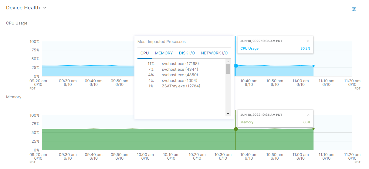
Depending on the device the user was on at the time, different information is available about that device. The Network and Disk options are preselected by default, and you can choose the elements you want to review. This selection remains even when navigating to a different user page or viewing a Diagnostics session. To learn more about Diagnostics, see About Diagnostics.
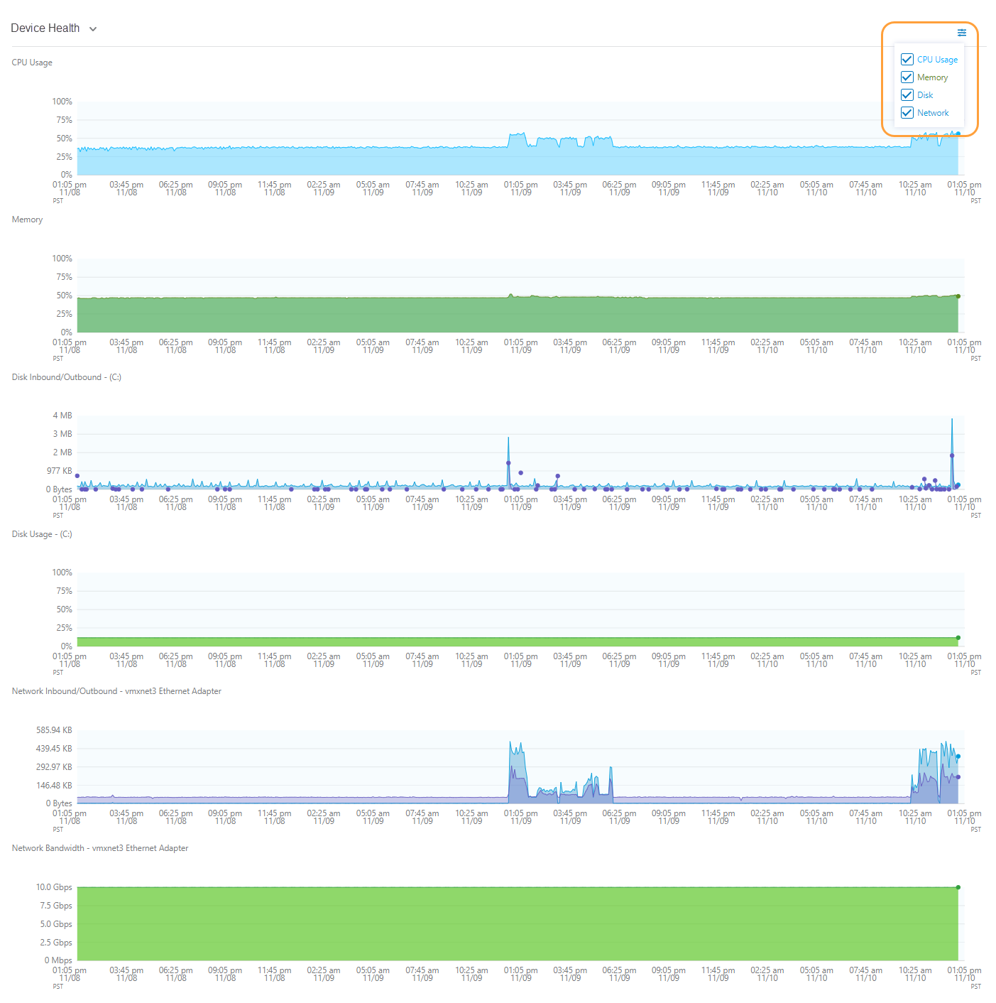
Select a place on a graph to see the value or percentage for that exact date and time. By selecting a point on one graph, all graphs show their values for that same point. For users with an Advanced Plus subscription, the most impacted processes are also displayed for applicable CPU, Memory, Disk I/O, and Network I/O, regardless of which graph is selected. A maximum of 5 processes is shown for each element within a given 5-minute interval. Click the Expand icon or Collapse icon to the right of the section label to expand or collapse this section.
Close - User Device Events
User Device Events tracks the events for a device over a selected period of time. An event can reflect an attribute change that has occurred, based on the attribute details under User Devices. Hover over the line of events to see details about each event. You can see:
- Type: The event that occurred.
- Attribute: The attributes associated with type. Not all types have an attribute.
- Previous Value: The value from a previous point in the line of events.
- New Value: The value at that point in the line of events.
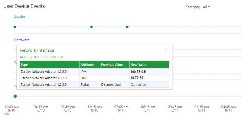
You might also see the following icons on the event line:
- A Sleep icon indicates a dormant period when no activity is rendered within a particular timeline.
- A Power icon indicates the device was rebooted.
- A Notification icon indicates a notification about a Self Service issue was sent to the user.
The Category drop-down menu provides the option to filter the event categories for Zscaler, Hardware, Software, Network, and Microsoft Endpoint:
Close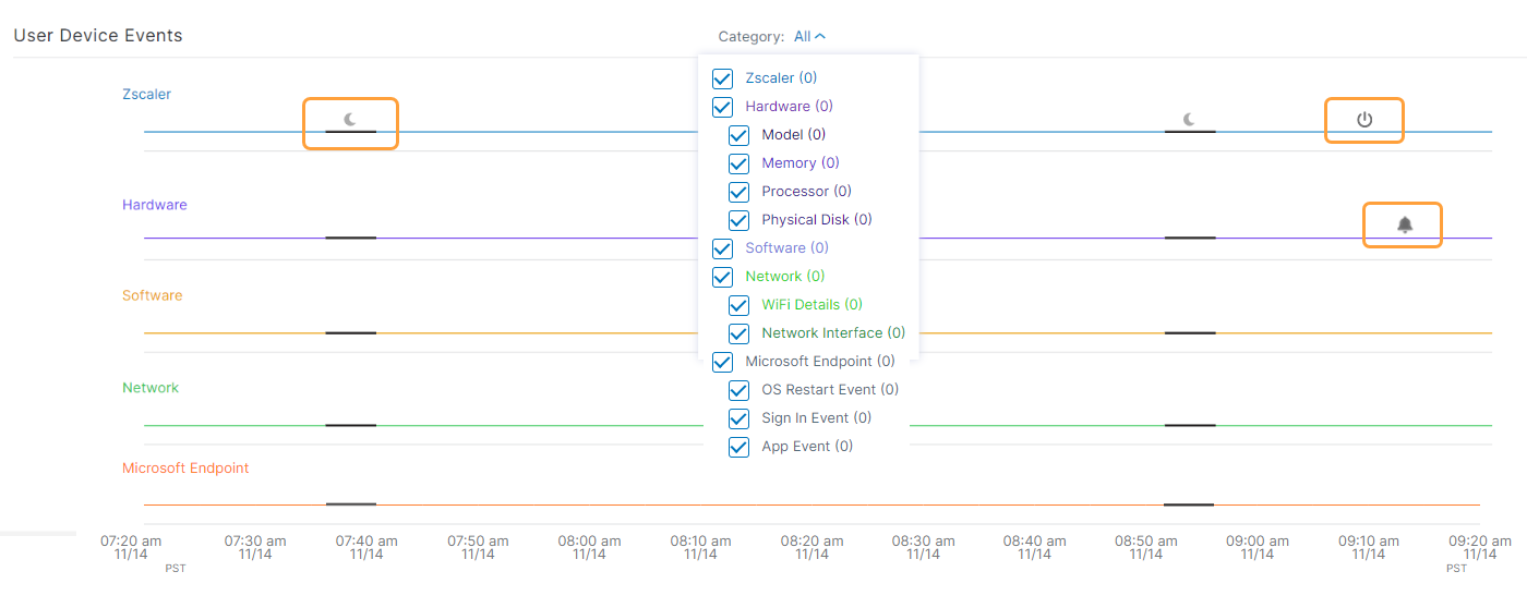
- Diagnostics
Diagnostics in Digital Experience Monitoring can provide deeper granularity into process-level information for a user. Click Start Diagnostics to begin a Diagnostics session. This opens a session window with user details prefilled. To learn more, see About Diagnostics.
Close
To learn more about performance data on the Users Overview page, see Monitoring the Users Overview.

